Hello Framers,
As I put together the tutorials I realise how gross an inconsistent size is for the entire experience of traversing these slabs of information. To help me make something smooth and seemless between tutorial patches would anyone who has the time here be able to send me a couple of things.
- A full screen Max patch dragged from corner to corner. If you keep your Dock out on MacOS then keep it like that. Here is mine for reference:
-
A label for the size and resolution of your screen. So mine would be 15" 2880 x 1800.
-
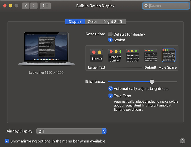
Disclose if you use any of the below features to scale your display:
Thanks!


